08/10/18 - 15/10/18 (Week 7 - Week 8)
Ng Jia Jin (0331589)
Advanced Typography
Project 2: Typosexual Typographic Exhibition - Collateral
Lecture Notes
8/10/2018 (Week 7)
For this week's lecture, another group from the class presented another typography topic called Type Design Methodology.
Here are the slides from their presentation:
Instruction
8/10/2018 (Week 7)
For this week, we were introduced to to our second project which is
Typosexual Typographic Exhibition - Collateral. This project is continuation to our first advanced typography project because for this project, we need to design a poster for the exhibition with the key artwork that we designed for our first project. We need to use the key artwork that we designed and apply it to 3 different mediums which are a poster, an e-invite and one more thing of our choice.
Here are the 2 key artworks that I'm going to implement in the 3 mediums (poster, e-invite and one thing from our choice).
 |
| Fig 1.0: Key Artwork - Colored |
 |
| Fig 1.1: Key Artwork - Black & White |
1st Medium - Poster Design
Our first part of this project is to design a poster with our key artwork in it. The poster that we are going to design should be in A3 size and only in vertical order. We can also adjust the measurement for the width but we need to maintain the measurement for the height of the poster. Mr Vinod advised us to start off with the black & white key artwork so that we won't be distracted by the colors used. Besides, he also advised us to follow the typographic system we learned at the start of this semester when it comes to poster design. In our poster design, we also need to include certain information about the exhibition.
 |
| Fig 1.2: Information About The Exhibition |
Before doing any poster design, I did some rough composition sketches out so that I can have a better idea on how is my poster design is going to turn out to be.
 |
| Fig 1.3: Rough Sketch of Poster |
After finalizing the sketches that I did for my poster design, I went on to Adobe Illustrator to start out my poster design. I started off with my black & white key artwork as advised by Mr Vinod so that I wont be distracted by the colors. For my first poster design, I decided to adapt the
Bilateral Typographic System.
 |
| Fig 1.4: First Poster Design Process #1 |
After playing with only black & white, I decided to keep my key artwork black & white but instead I added some colors to my contents.
 |
| Fig 1.5: First Poster Design Process #2 |
Here is my final compositions for my first poster design.
 |
| Fig 1.6: Poster Design #1 - Black & White |
 |
| Fig 1.7: Poster Design #1 - Colored |
After finishing my first poster design, I decided to try out the
Dilatational Typographic System for my next poster design. For this, I used my colored key artwork because I'm getting comfortable with colors already.
 |
| Fig 1.8: Second Poster Design Process #1 |
 |
| Fig 1.9: Second Poster Design Process #2 |
Here is my final composition for my second poster design.
 |
| Fig 2.0: Poster Design #2 |
Since I missed a class of Advanced Typography, I went online to ask for Mr Vinod's feedback regarding to my final composition for my poster design. He said that my black poster background seems to be swallowing the overall work. Besides, the placement of the text don't seem well anchored and seems to be floating. He advised me to go and look at my classmates' works and re-evaluate my work against theirs.
I went on and redo my overall design because I think it wasn't good enough and the curves are not smooth enough.
 |
| Fig 2.4: Final Poster Design Composition - Colored |
15/10/2018 (Week 8)
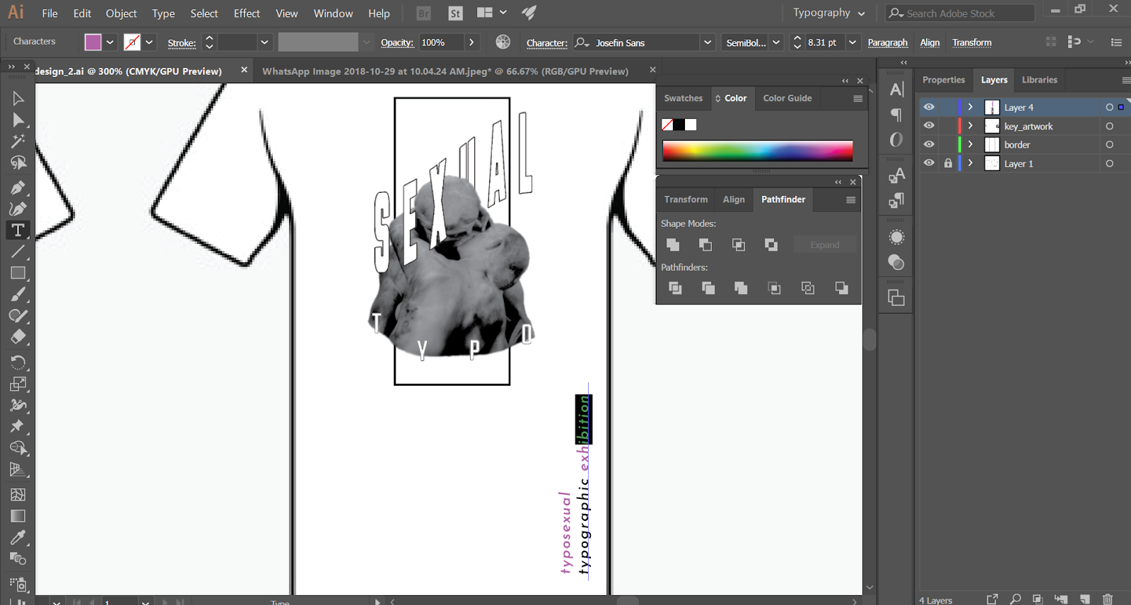
2nd Medium - Shirt Design
After completing my poster design, I then went on to design my 2nd medium which is a shirt. I had to redesign a design for my shirt with my key artwork on it.
 |
| Fig 2.5: Shirt Design Process #1 |
 |
| Fig 2.6: Final Shirt Design #1 |
After receiving some feedback, I decided to re-design my whole shirt design because my lecturers said that my design looks very empty front & back and the words 'Typographic Exhibition' looks weird around the frames.
Submission Week
It's submission this week and here are the mediums that I need to submit for this project.
1st Medium: Exhibition Poster
 |
| Fig 3.6: Poster |
 |
| Fig 3.7: Poster Design (In Frame) |
2nd Medium: Shirt Design
 |
| Fig 3.8: Shirt Design |
 |
| Fig 3.9: T-Shirt Design (Front) |
 |
| Fig 4.0: T-Shirt Design (Back) |
Feedbacks
Week 7:
General Feedback: For the groups that presented on this week, Mr Vinod said they did a great job because there's enough information to present to the audience. For project 2 wise, Mr Vinod asked us to sketch out some rough sketches on how we want to design our poster before transferring it digitallly.
Specific Feedback: Mr Vinod asked me to do some sketches before designing the poster because I designed my poster halfway through without sketching out my rough composition.
Week 8:
General Feedback: Mr Vinod told us that we shouldn't only stick with one typographic system when it comes to designing our poster. We need to explore more systems and designs so that we can have more options to choose afterwards.
Specific Feedback: Mr Vinod told me that my black poster background seems to be swallowing the overall work. Besides, the placement of the text don't seem well anchored and seems to be floating. He advised me to go and look at my classmates' works and re-evaluate my work against theirs.
Week 9:
General Feedback: Mr Vinod told us to try and create an interesting layout in whatever product we're going to put our key artwork in. If we are going to design a shirt, we should design the back of the shirt as well.
Specific Feedback: Mr Vinod said that my key artwork is too simple compare to the others. He asked me to redesign my shirt design as well since my design is also pretty simple and straight forward.
Reflection
Experience
Week 7:
We were introduced to our second project for this subject and I also got a much needed feedback from Mr Vinod regarding to my key artwork.
Week 8:
I didn't attend advance typography class this week.
Week 9:
This week's class was not as heavy as some previous classes because we are redesigning our key artwork so that we can apply it to our second medium which is a product of our choice such as a badge and more.
Observations
Week 7:
I find that designing a poster and placing a key artwork to it is more than just a poster design because in order to make it appealing, we need to make the poster design with all the information somehow connected with the poster design.
Week 8:
I didn't observe anything today because I didn't attend the class today.
Week 9:
Everyone is concentrated in redesigning their key artwork so that they can apply it to their respective chosen products. I went around to get some ideas from my classmates and I saw some very interesting ones.
Findings
Week 7:
I find that designing a poster with the key artwork that I designed is interesting because I am able to express my ideas and thoughts to it.
Week 8:
I didn't find anything today because I didn't attend the class today.
Week 9:
I find that applying my key artwork to a product such as a shirt or a phone case is not as easy as it seems because we need to redesign everything and then consider the placements, the whole idea of it.
I Love Din
10/10/2018
 |
| Fig 2.5: I Love Din by TwoPoints.Net |
I Love Din is a book edited and published by a design studio call TwoPoints.Net. This book has no specific author because this book is a compilation of many interesting graphic design related from all around the world. This book mainly focus on graphic design related designs such as packaging design, poster design and branding design.
 |
| Fig 2.6: Poster Designs |
What makes this book interesting and very helpful in my opinion is how they explain the elements in the posters such as the typefaces used and also why does it suit the particular poster. All these explanations makes it the whole book very useful for design students and also those who wants to learn more about it.
 |
| Fig 2.7: Packaging Design |
 |
| Fig 2.8: Bag Design |
Overall, I think this book is a must read for all designers all design students out there as it will help us to understand more about certain design elements and most importantly in choosing the correct typeface for your next design.


Thank you for sharing with us,I too always learn something new from your post.we provide.Luminous Attire Solutions Your Singapore Uniform Partner.T Shirt Printing Singapore
ReplyDelete