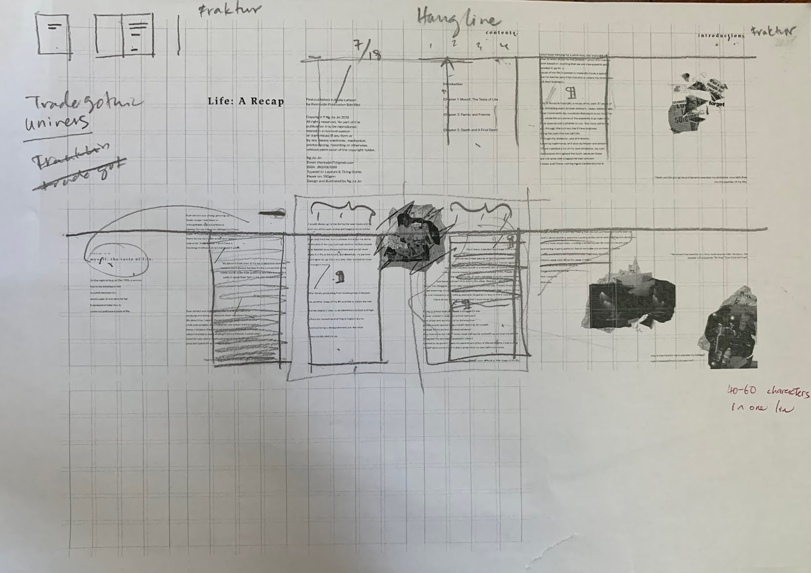
After doing some research, we need to determine the grid and layout for our book so that we can start putting our information together already. To start off, I designed my layout on Adobe InDesign. I created a 4x6 grid system with a gutter of 5mm each.
 |
| Fig 2.1: Layout Design |
After I determined the layout, I then try out with different typeface combination to see which one suits my information the most. I tried out 4 typeface combinations.
After that I started to put my information into the book layout so that I know how does my book roughly looks with the layout system. I started off by putting in the texts and artworks for my first chapter.
 |
| Fig 2.2: Process on InDesign #1 |
 |
| Fig 2.3: Process on InDesign #2 |
 |
Fig 2.4: Process on InDesign #1
|
Here are my spreads as my first attempt to include my story and my artworks together:
 |
| Fig 2.5: Experimental Layout #1 |
 |
| Fig 2.6: Experimental Layout #2 |
 |
| Fig 2.7: Experimental Layout #3 |
 |
| Fig 2.8: Experimental Layout #4 |
 |
| Fig 2.9: Experimental Layout #5 |
6/5/2019 (Week 6)
For this week, we need to print out our experimental layout to show Mr Vinod so that he can give us the feedback for improvement.
 |
| Fig 3.0: Printed Spreads |
Mr Vinod gave me a lot of feedback regarding to my sentence placement and how I should create a harmony relationship between my artworks and the sentences that I want to put in each spreads. Besides feedback regarding to my layouts, he also suggested me to use a different typeface for my body text because he thinks that the one I'm currently using is too wide. He also told me to follow a hangline for every sentences because it keeps the whole book consistent.
21/5/2019 (Week 8)
For this week, I showed Mr Vinod my black and white book mock-up so that he could give me some feedback about it. After looking through my book, he told me that some artworks of mine are pretty pixelated and needs to be changed, Besides that, he also told me that my body texts are pretty big so he asked me to drop to 9PT instead of 10PT. Overall, he told me it's good to go but he also asked me to design a cover design for it.
Final layout for my book:
 |
| Fig 5.6: Final Layout #1 |
 |
| Fig 5.7: Final Layout #2 |
 |
| Fig 5.8: Final Layout #3 |
 |
| Fig 5.9: Final Layout #4 |
 |
| Fig 6.0: Final Layout #5 |
 |
| Fig 6.0: Final Layout #6 |
 |
| Fig 6.1: Final Layout #7 |
 |
| Fig 6.2: Final Layout #8 |
 |
| Fig 6.3: Final Layout #9 |
 |
| Fig 6.4: Final Layout #10 |
 |
| Fig 6.5: Final Layout #11 |
 |
| Fig 6.6: Final Layout #12 |
 |
| Fig 6.7: Final Layout #13 |
 |
| Fig 6.8: Final Layout #14 |
 |
| Fig 6.9: Final Layout #15 |
27/5/2019 (Week 9)
For this week, after finalizing my book layout, I also went to design my book cover design. I left my front page blank except for my book title and the main designs consist as the back cover of the book.
Here is my book cover design:
 |
| Fig 7.0: Book Cover Design |
Embedded file for my final book layout:
Final hard copy of the book:
 |
| Fig 7.1: Final Book Cover (Front) |
 |
Fig 7.2: Final Book Cover (Back) |
 |
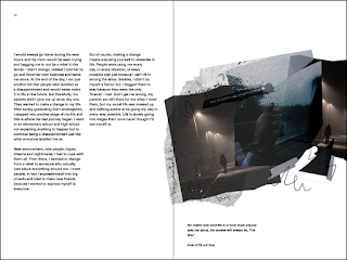
| Fig 7.3: Final Book Spreads #1 |
 |
| Fig 7.4: Final Book Spreads #2 |
 |
| Fig 7.5: Final Book Spreads #3 |
 |
| Fig 7.6 : Final Book Spreads #4 |
 |
| Fig 7.7: Final Book Spreads #5 |
 |
| Fig 7.8: Final Book Spreads #6 |
Feedback
6/5/2019 (Week 6)
General Feedback: Mr Vinod told us that every time when we create a layout, we need to always follow the hangline and also the grid system.
Specific Feedback: Mr Vinod told me that my texts for my book is all over the place. He said that I need more consistency in my text placement and also to follow the hangline on my layout. After placing all the texts that I want, then he only told me to place the artworks. He also asked me to change the typeface for my title and my body text. Lastly, he asked me to change the font size for my content page.
13/5/2019 (Week 7)
Specific Feedback: Mr Vinod told me to always follow the layout when it comes to putting together the information. He also told me that to reduce the letter size because it was too big. For now, work on the overall layout and also to make the overall book design look consistent and also aligned.
20/5/2019 (Week 8)
Specific Feedback: Mr Vinod said that the overall visual and text placement is good to go and the layout is also good to go. However, after looking at my actual mock-up for my book. He told me to decrease the font size 1 point because it looks pretty big in actual size. Besides that, he also ask me to fix the pixelated artworks because it looks pretty pixelated and blurry.
27/5/2019 (Week 9)
Specific Feedback: Mr Vinod said that the overall visual and text placement is good to go and the layout is also good to go. However, after looking at my actual mock-up for my book. He told me to decrease the font size 1 point because it looks pretty big in actual size. Besides that, he also ask me to fix the pixalated artworks because it looks pretty pixelated and blurry.
10/6/2019 (Week 11)
Specific Feedback: Mr Vinod asked me to try and print the black pages for physical book on black paper so that it has a texture. He also asked me to try out the metallic finishing for my book title so that it stands out a little. For now, the book looks a little bit blend and because my book cover is only black in colour. Besides, he also asked me to change the barcode to white background because it can't be scanned and it's also pixalated. For E-porifolio wise, he asked me to update my blogs and then make a cover page for each blogs so that it looks presentable. He also asked me to crop out the unnecessary part for the images that I uploaded.
Reflection
Experience
6/5/2019 (Week 6)
I realize it is harder than expected to put all the information into a book because we need to step into the user's reading experience while creating it.
13/5/2019 (Week 7)
For this week, I'm just trying to put in all the chapters into my book and to make it look visually pleasing and also neat and it was difficult. I was trying to format the texts but also trying to make it look visually pleasing at the same time.
20/5/2019 (Week 8)
I finalized my book layout and finally achieved some consistency throughout my book. I was pretty satisfied with it but I know I can always do better than that.
27/5/2019 (Week 9)
Printing out my first book is pretty satisfying especially the artworks and the context are all created by ourselves. After getting my finalized book printed in colors, the outcome is pretty nice and also neat.
Observation
6/5/2019 (Week 6)
They are a few of my classmates that also have the same feedback from Mr Vinod too which is our information is all over the place and it doesn't look user friendly at all.
13/5/2019 (Week 7)
I went around to look at my classmates' layouts and I find that most of them are pretty minimal and also full of colorful artworks. From there, I gained a lot of ideas for my layout design.
20/5/2019 (Week 8)
After walking around and taking a look at everyone's layout, I know that I have room to improve for my next project.
27/5/2019 (Week 9)
Everyone's book looks very colorful and also minimalist while mine mainly consist of black and white. I also felt that my white space is a little more compare to the others.
Findings
6/5/2019 (Week 6)
I find it hard to put the information together without the help of the grid and layout system. These are the foundation when it comes to creating a book. I also found out that we really need to dive into the user's perspective when it comes to readability and also eye movements.
13/5/2019 (Week 7)
I find it hard to come out with a layout especially when it comes to ensuring that we need to have a consistent layout and text box size.
20/5/2019 (Week 8)
I think that one need to really understand how to have a good layout so that the text appears to be consistent and also neat at the same time.
27/5/2019 (Week 9)
The process of combining texts and also artworks is not that easy it seems because we have to make sure when adding the artwork together with the texts in a spread, we also need to make sure it doesn't look too cramp or out of place at the same time.


Comments
Post a Comment