Typography - Project 1
Ng Jia Jin (0331589)
Project 1 - Story Book
Lecture Notes
Lecture 6: Cancelled
1/5/2018 (Week 6)
This week's lecture class got cancelled because it was Labor Day that day.
Lecture 7: Letterforms / Project 1 Briefing
8/5/2018 (Week 7)
Mr Vinod mainly talked about the alignments, the spacing and the other important elements that we need to beware of in typography. Even a very small detail will affect the overall composition of the texts or sentences. After that, Mr Vinod and Mr Shamsul gave us a project briefing session for our upcoming project. Our upcoming project is to create a book titled Mr Babadook.
Lecture 8: Mr. Babadook
15/5/2018 (Week 8)
Mr Vinod mainly gave some critiques for our Mr. Babadook design developments for today's lecture. He asked us to not come out with crazy designs and distort the texts in the book because consistent is key when it comes to typography.
Lecture 9: Submission / Font Design
22/5/2018 (Week 9)
We didn't really have any lecture class today. Instead, Mr Vinod and Mr Shamsul went through our book design one by one and gave feedbacks about it.
Instruction
Project 1
Week 7
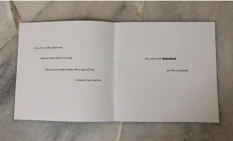
I attempted to design Mr. Babadook for the first time and these are my first draft before critiques from my lecturers.
 |
| Fig 2.1: First draft of my front cover for Mr Babadook |
 |
| Fig 2.2: First draft of Mr Babadook (Page 2-3) |
 |
| Fig 2.3: First draft of Mr Babadook (Page 4-5) |
 |
| Fig 2.4: First draft of Mr Babadook (Page 6-7) |
 |
| Fig 2.5: First draft of Mr Babadook (Page 8-9) |
 |
| Fig 2.6: First draft of Mr Babadook (Page 10-11) |
 |
| Fig 2.7: First draft of Mr Babadook (Page 12-13) |
 |
| Fig 2.8: First draft of Mr Babadook (Page 14-15) |
 |
| Fig 2.9: First draft of Mr Babadook (Page 16-17) |
 |
| Fig 2.10: First draft of Mr Babadook (Page 18-19) |
After receiving feedback from both Mr Vinod and Mr Shamsul, I decided to redo some pages and the front cover. The main reason is that most of my texts are not aligned and the title at my front cover is not really visible. Also, I didn't know we need to continue our sentences until the last page and that's why I left it blank as I thought it's suppose to act as a book cover.
Week 8
My design for Mr Babadook has finally been finalized after following the feedbacks given by Mr Vinod and Mr Shamsul last week.
After that, we need to upload it as spreads so that we can see all our book pages in a page.
 |
| Fig 3.1: Final Design for Mr Babadook (cover) |
 |
| Fig 3.2: Final design for Mr Babadook (Page 2-3) |
 |
| Fig 3.3: Final design for Mr Babadook (Page 4-5) |
 |
| Fig 3.4: Final design for Mr Babadook (Page 5-6) |
 |
| Fig 3.5: Final design for Mr Babadook (Page 7-8) |
 |
| Fig 3.6: Final design for Mr Babadook (Page 9-10) |
 |
| Fig 3.8: Final design for Mr Babadook (Page 11-12) |
 |
| Fig 3.9: Final design for Mr Babadook (Page 13-14) |
 |
| Fig 3.10: Final design for Mr Babadook (Page 15-16) |
After that, we need to upload it as spreads so that we can see all our book pages in a page.
 |
| Fig 3.11: Thumbnails for my Mr Babadook |
Embedded PDF file for Mr Babadook

Fig 4.1: Hardcopy of Mr Babadook (Front Cover)
 |
| Fig 4.2: Hardcopy of Mr Babadook |
 |
| Fig 4.3: Hardcopy of Mr Babadook |
 |
| Fig 4.4: Hardcopy of Mr Babadook |
 |
| Fig 4.5: Hardcopy for Mr Babadook (Page 15-16) |
Feedbacks
Week 6:
We have no class today because it was Labor Day
Week 7:
Mr Vinod mainly only gave us our project brief and some lecture sessions because we missed our class last week due to a public holiday.
Week 8:
Mr Shamsul said that my alignments and placement of sentences for my book is not aligned to each sentences. He also asked me to change the style of design for some of my pages because it's not really visible.
Week 9:
After Mr Vinod checked my hard copy of the book, he said that the spaces around my sentences are too much but overall the design is good. Besides that, he said that my Mr Babadook title for my front page is a little small for a title. However, he said that some of my book pages are visually pleasing because I used white background on a page and black on another. For my e-portfolio wise, he asked me to add more further reading to it and explain more about the lecture notes given.
Reflections
Experiences
Week 6: We didn't have class for today because it was Labor Day.
Week 7: I didn't really do anything for this week as we were only given the brief by Mr Vinod. I only started using Adobe InDesign this week so I only explored the features in the software for this week.
Week 8: The only problem that I experienced is that I ran out of ideas pretty quick when I was designing my book. By that, all my pages look like they have the same design for it.
Week 9: I experienced that designing a book is not easy but the final product is satisfying.
Week 9: I experienced that designing a book is not easy but the final product is satisfying.
Observation
Week 6: We didn't have class for today because it was Labor Day.
Week 7: Everyone was very concentrated in the class because Mr Vinod was giving the assignment brief to all of us.
Week 8: I realize that I'm getting better in Adobe InDesign compare to last week. I can design a sentence easily now, Besides that, I realized that most of my classmates are also getting better in designing their book.
Week 9: Everyone was very quiet when designing their own fonts. Besides, many of my classmates also ran out of idea for font designing just like me.
Week 9: Everyone was very quiet when designing their own fonts. Besides, many of my classmates also ran out of idea for font designing just like me.
Findings
Week 6: We didn't have class for today because it was Labor Day
Week 7: I didn't really find out anything for today's lesson mainly because Mr. Vinod mainly gave us a brief about what our upcoming project is all about. What I do find out is that, I was having a hard time using Adobe InDesign at first compare to some of my classmates.
Week 8: I found out that finding ideas to design the content for Project 1 is hard, some of my pages got rejected because the design or the layout is too simple and I have to redo it from scratch. But, after getting some input from the lecturers and my friends, I did better and all of my works got accepted at last.
Week 9: I found out that getting ideas for font designs is not easy at all, I was constantly checking online to get more ideas instead of designing the font with my own ideas.
Further Readings
15/5/2018 (Week 8)
Type Matters! by Jim Williams
 |
| Fig 5.1: Type Matters! by Jim Williams |
This book introduces us to the basics of Typography that typography beginners can take it as references. It packs with everyday tips for those who are keen to improve their type looks. This book is made for the elementary people who just stepped into the Typography world which mean if you have dealt with typography for some time, this book will probably not sustain your interest.
Overall, this book is packed with all the fantastic tips and examples of how to use typography. It covers both well known areas of typography like weight and letter spacing. Each items are detailed with an example of poorly used type and the effectively used type.


Comments
Post a Comment