Typography - Exercises
27/3/2018 - 4/10/2018 (Week 1 - Week 3)
Ng Jia Jin (0331589)
Typography
Exercises

Lecture Notes
Lecture 1: Briefing
27/3/2018 (Week 1)
We didn't have any lecture for our first week as expected. Mr. Vinod, our typography lecturer, gave us a brief overview of what typography is all about and what he expects from us for this semester. He also told us about the requirements for this subject such as creating an e-portfolio and the software that we need for our future works . He then briefed us about the differences between font & foundry.
After that, he also told us what materials should we buy for next week (Week 2) in order to kick start our typography exercises. He also showed us some examples of different type of typography style in order to give us an idea about typography. We had to do some research about the typography styles such as foundational, blackletter and uncial before our class next week starts.
Lecture 2: Introduction to Typography
3/4/2018 (Week 2)
This week we started off by drawing some horizontal, vertical lines and circles on graphy papers. The idea behind this exercise is to allow us to be familiar with caligraphy markers. I took quite some time to get used to it as it was my first time trying it but at the end of the day, I'm getting more comfortable than the start of the lesson.
Lecture 3: Letterings / History of Typography
10/4/2018 (Week 3)
Mr. Vinod started of by giving a brief about the history behind typography, from the development of typography to the timeline of it. He also stated that typography that we usually learn are written and developed in western format. For more information about it, he told us to look it up ourselves.
For early letterform developments, it begins with the Phoenicians uppercase letters which consist of straight lines and pieces of circle only. The Greeks then developed a writing style called boustrophedon. It basically means the lines of texts are read from left to right then from right to left.
Lecture 4: Name Design / Letterings
17/4/2018 (Week 4)
Mr. Vinod didn't really give any lecture for this week's Typography class. After checking all our previous typography, Mr. Vinod proceeded with this week's lesson. He asked us to transfer our name design that we did throughout last week into digital format.
Lecture 5: Type Expression
24/4/2018 (Week 5)
We didn't have any lecture lessons today. Mr. Vinod wanted us to continue with our type expression design that he asked us to do it at home. After approving all our designs and works, he then asked us to transfer it into a animated gif.
Instructions
This is the Module Information Booklet for Typography:
Exercise
Caligraphy Fundamentals (Week 1 - Week 2)
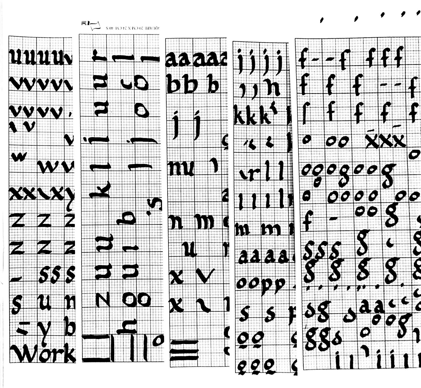
We had to get used to the caligraphy marker that we are going to use so Mr. Vinod told us to practice drawing some circles, vertical and horizontal lines. He told us that we need to consistent we the thickness of it and ensure that both sides of the lines are slanted. After completing the following practice, we need to begin on the lettering practice. I chose Foundational because I like the curvy style of it. At first, it was hard for me to write it because of the curvy letterings, but after knowing some basic techniques, I started to get more comfortable.
 |
| Fig 1.1: Vertical, horizontal lines and circles attempts |
 |
| Fig 1.2: Final product for vertical, horizontal lines and circles |
 |
| Fig 1.3: Foundational Hands Examples |
 |
| Fig 2.1: Practice for foundational hands (A-Z) |
 |
| Fig 2.2: Practice for foundational hands (A-Z) |
 |
| Fig 2.4: Some practices before I transfer to my final drafts above |
Quotes & Letterings (Week 3)
We need to choose a quote of our choice and practice it on graph papers before transferring it onto a blank A4 paper. After completing our quotes, we need to design at least 3 kinds of different designs by using our names.
 |
| Fig 2.5: Some practices of the quote that I chose |
 |
| Fig 2.6: My quote on graph paper |
 |
| Fig 2.7: Final quote on a clear A4 paper |
Name Design (Week 4)
We had to design our name and then transfer it to digital form by using Adobe Illustrator and Adobe Photoshop. I did some name design the previous week to start things off.
 |
| Fig 2.8: Some designs for my name |
 |
| Fig 2.8: Selected final name designs |
 |
| Fig 2.9: Selected name design traced in Adobe Iluustrator |
I chose a bold name design because I like the thick stroke lines and it also reflects my personality. After deciding on what animation to use for my name design, I went on to Adobe Illustrator and created some artboards for the animations.
Initially, I did a bold expression but my work got rejected by Mr. Vinod because he said that my animated gif doesn't represent the word bold.
 |
| Fig 2.10: Artboards on Adobe Illustrator for my first animation |
 |
| Fig 2.11: Initial animated gif for bold |
After that, I decided to redo my whole animation so that it represents bold.
 |
| Fig 2.12: My name design on Adobe Illustrator |
After an hour, I'm finally done with my animated name gif.
 |
| Fig 2.13: Final Result (Bold) |
We had to design 6 words given by Mr. Vinod and then transfer one of the words to an animated gif. The 6 words are dead, stress, loud, dark, drunk and quick. We used Adobe Illustrator and Adobe Photoshop for this week's exercise just like our previous exercises.
 |
| Fig 2.14: Type Expression attempts |
After Mr. Vinod critiqued my work, he said that my stress doesn't look stress at all so he suggested me to design a new one instead.
 |
| Fig 2.15: Final outcome of my Type Expression Design |
I decided to use the word dark for my animated type expression gif.
 |
| Fig 2.16: Type expression for DARK |
After that, I used Adobe Illustrator and Adobe Photoshop to make an animated gif for the word I chose.
 |
| Fig 2.17: Exporting my artboards in Adobe Photoshop |
 |
| Fig 2.18: Final Outcome (Dark) |
Feedbacks
Week 1:
We were not given any feedbacks as there was no exercises or practices.
Week 2:
Mr. Vinod told the whole class that there're many factor that will effect our outcome such as the surface of the table, the way we hold our type of paper that we are using. Besides, Mr. Vinod said that my overall work is decent. However, he asked me to draw out slanted vertical lines and horizontal lines instead of the straight ones, he also asked me to connect the circles properly so that it won't leave a connection mark over there.
Week 3:
Mr. Vinod told me that I have improved at my vertical, horizontal lines and circular strokes compare to the one I did on Week 2. However, he also told me that my spacing between each lines of alphabets are not consistent. I am supposed to leave 5 square gaps in between each lines. My work overall is decent but he told me that to not rush when I'm doing the typography exercises.
Week 4:
Mr. Vinod said that the strokes for my final quote writing is inconsistent and my spacing between each alphabets is too big. I also need to improve my starting and ending points for each letter. Overall, my quotes are acceptable with some flaws. Mr. Vinod asked me to rewrite my quotes if I have the time for a better marks than the current one.
Week 5:
Mr. Vinod said that the animation for my name type expression doesn't show the characteristic of the design I did, which is bold. He asked me to redo it so that it shows the cahracteristic I'm trying to show. For my 6 words type expression wise, he accepted most of the words design except the 'stress' and 'dead' words. He said the design for my 'stress' didn't look vusually stressed and my 'dead' word didn't look dead enough. For my other words, I only need to minor refinements such as the 'loud' word. He said it's better if I delete the shadows around the 'loud' word.
Week 6:
There's no feedback for this week as our class was clashed with Labour Day.
Reflections
Experiences:
Week 1: Since the first week was all about subject briefing, I didn't really experience anything about typography yet.
Week 2: This was my first time experiencing typography exercises. I found it quite hard at first as I was not used to the style of writing yet. I noticed that some of my classmates were experiencing the same situation too.
Week 3: I started my typography exercises a little easier compare to the previous week as I have gotten used to the style of writing. I did practice quite a while to get the groove of it but overall it was a breeze.
Week 4: I had to transfer my name that I designed into digital format by using Adobe Illustrator and Adobe Photoshop. I didn't really get to the speed of everyone when transferring my name as I'm not really familiar with the softwares. I managed to transfer my name at the end of getting familiar with it and also did some simple animations for my name as a start.
Week 5: I had to design 6 words which are 'dead', 'stress', 'dark', 'drunk', 'quick' and 'loud' using Adobe Illustrator and Adobe Photoshop. Most of my words design got accepted except the 'stress' word because Mr. Vinod said it was not stress enough. I find it quite hard to design the words especially 'stress' because I ran out of ideas when I was redesigning it. At the end, Mr. Vinod accepted all my words designs.
Week 6: Since it was Labour Day, we had no class for this week.
Observations
Week 1: I didn't observe anything special as all of my classmates were listening to Mr. Vinod's brief about typography too.
Week 2: I realised that everyone was also struggling to start typography exercises as not everyone is experienced at it. During the class, everyone was very quiet as we need to put in our full concentration when writing the typography exercises. We were all trying our best to achieve the outcome that we wanted.
Week 3: Mr. Vinod started off our class for this week with some history of typography. Everyone is focus at it as we need to take down some notes from the lesson. After that, we got to practice writing a quote of our choice on the graph paper. I realised that all of my classmates started off their quotes with the choice of their hands easily compare to the previous week. Everyone has gotten used to it that most of us didn't rely on the reference that was given by Mr. Vinod.
Week 4: Mr. Vinod gave everyone critics about their final works for the first month of typography practices to start of the class. After that, he went to everyone individually to choose a name design that he asked us to design on week 3. After choosing our design, we then transferred our name design to digital format because for this week's exercise, we need to make a gif from our name design.
Week 5: We need to design 6 words given by Mr. Vinod for today's class. Everyone was trying their best to design all the 6 words. Some of us got our word designs rejected because it didn't really show the meaning of the words through the designs. After getting our word designs accepted, we then need to choose 1 out of the 6 words that we think it's the best to turn it into an animation gif.
Week 6: Since it was Labour Day, we had no class for the week.
Findings
Week 1: There's nothing to talk about as I have not started practicing typography yet.
Week 2: As I start practicing typography, I found out that I need to practice writing the alphabet that I want on a seperate piece of paper in order to get the groove of it. During the writing process, I also tend to eliminate distractions around my tables as I gotta be fully focused with my work. One thing I noticed about myself is that I tend to switch the position of the nib of my pen when I'm writing and that's the habit I hope to eliminate in the future.
Week 3: After 1 week of typography exercises, I found out that it's quite hard for me to produce thin strokes of lines. My strokes of lines are quite thick and I guess I got to practice more in order to produce different thickness of lines.
Week 4: This week's exercise is all about using Adobe Photoshop & Illustrator. We need to edit a gif from our name design by using both of the Adobe Suites. I started off quite slow compare to some of my friends because I still don't how the Adobe Suites works. But after getting to know it better, I traced out my name in a breeze.
Week 5: As I start with my words type expression design, I didn't really have any trouble using Adobe Illustrator and Adobe Photoshop as I have already know the basics for it. However, I find that getting ideas for me is hard because when I was designing the stress word, I have no idea or whatsoever of designing it at the start. I took quite a while to get my work to be accepted.
Week 6: Since it was Labour Day, we had no class for the week.
Further Readings
28/3/2018 (Week 1)
The Fundamentals of Typography by Gavin Ambrose & Paul Harris
This book talks about all the fundamentals in typography, from the font styles to the evolution of typography. This book is more for us to gain ideas for typography designs. All the basic typography designs are explained with detailed descriptions and sample examples from other typographer.
The part in this book that caught my attention is the history of typography designs. I like how typography evolved so much since its introduction. I gained a lot of ideas for my lettering exercises from this book too.
The next part of the book that is interesting the grid & fonts. It introduces the usage of grids in typography and letterforms built around it. Grids are used in any medias nowadays, from the shops signs, magazines cover to the road signs. People use grids in their typography designs because it gives out a clearer information and clearer visibility overall.
3/4/2018 (Week 2)
I didn't read any book about typography for this week.
10/4/2018 (Week 3)
Typographic Design: Form and Communication (Fourth Edition) by Rob Carter, Ben Day & Philip Meggs
This book talks about how typography has undergone various changes over the past six decades. In additional to that, it also offers wide varieties of topics about typography such as legibility factors, typographic technolgies and type specimens. For this, it gives designers and students an expanded awarness about typography.
I like the part when the book explains about typography technologies and it all started during the Industrial Revolution. Typography has evolved from hand composition to today's electronically generated typography. There are also many technologies used throughout the past decades such as linotype machine, monotype keyboard and ludlow linecaster. For this, it helped me to understand about the developments and productions of typography throughout the decades.
16/4/2018 (Week 4)
Tasty Stories: legendary food brands and their typefaces by Joke Gosse
For this book, it talks about the history of 23 legendary food brands that is directly linked to the different type of styles that they have been used in their past advertisements and packaging. Brands such as Coca-Cola, KitKat, Tobasco and Heinz are also featured in this book.
I like when it introduces to different typefaces for each packaging designs, it gave me a rough idea on what typefaces to use for my type expression exercise. I gained a lot of ideas via this book because they have all sort of interesting typefaces to be used.
23/4/2018 (Week 5)
The Anatomy of Type: A Graphic Guide to 100 Typefaces
This book explores one hundred traditional and modern typefaces in details. It also explains what kind of impression or expression that different weight and different strokes of typefaces will bring out. Don't worry if you ran out of idea while thinking of what typefaces to use, this book got you covered. It explains the typefaces clearly and full of information.
What I like about this book is that there're many typefaces for me to refer too whenever I can't think of one. Although not as detailed as the books that I read previously but it still got the job done.
30/4/2018 (Week 6)
I didn't read any book that is related to typography studies for this week.
Week 3:
Mr. Vinod told me that I have improved at my vertical, horizontal lines and circular strokes compare to the one I did on Week 2. However, he also told me that my spacing between each lines of alphabets are not consistent. I am supposed to leave 5 square gaps in between each lines. My work overall is decent but he told me that to not rush when I'm doing the typography exercises.
Week 4:
Mr. Vinod said that the strokes for my final quote writing is inconsistent and my spacing between each alphabets is too big. I also need to improve my starting and ending points for each letter. Overall, my quotes are acceptable with some flaws. Mr. Vinod asked me to rewrite my quotes if I have the time for a better marks than the current one.
Week 5:
Mr. Vinod said that the animation for my name type expression doesn't show the characteristic of the design I did, which is bold. He asked me to redo it so that it shows the cahracteristic I'm trying to show. For my 6 words type expression wise, he accepted most of the words design except the 'stress' and 'dead' words. He said the design for my 'stress' didn't look vusually stressed and my 'dead' word didn't look dead enough. For my other words, I only need to minor refinements such as the 'loud' word. He said it's better if I delete the shadows around the 'loud' word.
Week 6:
There's no feedback for this week as our class was clashed with Labour Day.
Reflections
Experiences:
Week 1: Since the first week was all about subject briefing, I didn't really experience anything about typography yet.
Week 2: This was my first time experiencing typography exercises. I found it quite hard at first as I was not used to the style of writing yet. I noticed that some of my classmates were experiencing the same situation too.
Week 3: I started my typography exercises a little easier compare to the previous week as I have gotten used to the style of writing. I did practice quite a while to get the groove of it but overall it was a breeze.
Week 4: I had to transfer my name that I designed into digital format by using Adobe Illustrator and Adobe Photoshop. I didn't really get to the speed of everyone when transferring my name as I'm not really familiar with the softwares. I managed to transfer my name at the end of getting familiar with it and also did some simple animations for my name as a start.
Week 5: I had to design 6 words which are 'dead', 'stress', 'dark', 'drunk', 'quick' and 'loud' using Adobe Illustrator and Adobe Photoshop. Most of my words design got accepted except the 'stress' word because Mr. Vinod said it was not stress enough. I find it quite hard to design the words especially 'stress' because I ran out of ideas when I was redesigning it. At the end, Mr. Vinod accepted all my words designs.
Week 6: Since it was Labour Day, we had no class for this week.
Observations
Week 1: I didn't observe anything special as all of my classmates were listening to Mr. Vinod's brief about typography too.
Week 2: I realised that everyone was also struggling to start typography exercises as not everyone is experienced at it. During the class, everyone was very quiet as we need to put in our full concentration when writing the typography exercises. We were all trying our best to achieve the outcome that we wanted.
Week 3: Mr. Vinod started off our class for this week with some history of typography. Everyone is focus at it as we need to take down some notes from the lesson. After that, we got to practice writing a quote of our choice on the graph paper. I realised that all of my classmates started off their quotes with the choice of their hands easily compare to the previous week. Everyone has gotten used to it that most of us didn't rely on the reference that was given by Mr. Vinod.
Week 4: Mr. Vinod gave everyone critics about their final works for the first month of typography practices to start of the class. After that, he went to everyone individually to choose a name design that he asked us to design on week 3. After choosing our design, we then transferred our name design to digital format because for this week's exercise, we need to make a gif from our name design.
Week 5: We need to design 6 words given by Mr. Vinod for today's class. Everyone was trying their best to design all the 6 words. Some of us got our word designs rejected because it didn't really show the meaning of the words through the designs. After getting our word designs accepted, we then need to choose 1 out of the 6 words that we think it's the best to turn it into an animation gif.
Week 6: Since it was Labour Day, we had no class for the week.
Findings
Week 1: There's nothing to talk about as I have not started practicing typography yet.
Week 2: As I start practicing typography, I found out that I need to practice writing the alphabet that I want on a seperate piece of paper in order to get the groove of it. During the writing process, I also tend to eliminate distractions around my tables as I gotta be fully focused with my work. One thing I noticed about myself is that I tend to switch the position of the nib of my pen when I'm writing and that's the habit I hope to eliminate in the future.
Week 3: After 1 week of typography exercises, I found out that it's quite hard for me to produce thin strokes of lines. My strokes of lines are quite thick and I guess I got to practice more in order to produce different thickness of lines.
Week 4: This week's exercise is all about using Adobe Photoshop & Illustrator. We need to edit a gif from our name design by using both of the Adobe Suites. I started off quite slow compare to some of my friends because I still don't how the Adobe Suites works. But after getting to know it better, I traced out my name in a breeze.
Week 5: As I start with my words type expression design, I didn't really have any trouble using Adobe Illustrator and Adobe Photoshop as I have already know the basics for it. However, I find that getting ideas for me is hard because when I was designing the stress word, I have no idea or whatsoever of designing it at the start. I took quite a while to get my work to be accepted.
Week 6: Since it was Labour Day, we had no class for the week.
Further Readings
28/3/2018 (Week 1)
The Fundamentals of Typography by Gavin Ambrose & Paul Harris
 |
| Fig 3.1: The Fundamentals of Typography by Gavin Albrose & Paul Harris |
This book talks about all the fundamentals in typography, from the font styles to the evolution of typography. This book is more for us to gain ideas for typography designs. All the basic typography designs are explained with detailed descriptions and sample examples from other typographer.
The part in this book that caught my attention is the history of typography designs. I like how typography evolved so much since its introduction. I gained a lot of ideas for my lettering exercises from this book too.
The next part of the book that is interesting the grid & fonts. It introduces the usage of grids in typography and letterforms built around it. Grids are used in any medias nowadays, from the shops signs, magazines cover to the road signs. People use grids in their typography designs because it gives out a clearer information and clearer visibility overall.
3/4/2018 (Week 2)
I didn't read any book about typography for this week.
10/4/2018 (Week 3)
Typographic Design: Form and Communication (Fourth Edition) by Rob Carter, Ben Day & Philip Meggs
 |
| Fig 3.2: Typographic Design: Form and Communication (Fourth Edition) by Rob Carter, ben Day & Philip Meggs |
This book talks about how typography has undergone various changes over the past six decades. In additional to that, it also offers wide varieties of topics about typography such as legibility factors, typographic technolgies and type specimens. For this, it gives designers and students an expanded awarness about typography.
I like the part when the book explains about typography technologies and it all started during the Industrial Revolution. Typography has evolved from hand composition to today's electronically generated typography. There are also many technologies used throughout the past decades such as linotype machine, monotype keyboard and ludlow linecaster. For this, it helped me to understand about the developments and productions of typography throughout the decades.
16/4/2018 (Week 4)
Tasty Stories: legendary food brands and their typefaces by Joke Gosse
 |
| Fig 3.3: Tasty Stories: legendary food brands and their typefaces by Joke Gosse |
For this book, it talks about the history of 23 legendary food brands that is directly linked to the different type of styles that they have been used in their past advertisements and packaging. Brands such as Coca-Cola, KitKat, Tobasco and Heinz are also featured in this book.
I like when it introduces to different typefaces for each packaging designs, it gave me a rough idea on what typefaces to use for my type expression exercise. I gained a lot of ideas via this book because they have all sort of interesting typefaces to be used.
23/4/2018 (Week 5)
The Anatomy of Type: A Graphic Guide to 100 Typefaces
 |
| Fig 3.4: The Anatomy of Type: A Graphic Guide to 100 Typefaces |
This book explores one hundred traditional and modern typefaces in details. It also explains what kind of impression or expression that different weight and different strokes of typefaces will bring out. Don't worry if you ran out of idea while thinking of what typefaces to use, this book got you covered. It explains the typefaces clearly and full of information.
What I like about this book is that there're many typefaces for me to refer too whenever I can't think of one. Although not as detailed as the books that I read previously but it still got the job done.
30/4/2018 (Week 6)
I didn't read any book that is related to typography studies for this week.


Comments
Post a Comment