Publishing Design - Project 1

1/4/2019 - 22/4/2019 (Week 1 - Week 4)
Ng Jia Jin (0331589)
Publishing Design
Project 1 - Content Generation
Lecture Notes
1/4/2019 (Week 1)
On our first day of the class, Mr Vinod gave us a short brief about what is this program about and also what is he expecting from us in this semester. After that, he explained about the projects that we are going to do.
8/4/2019 (Week 2)
For our second class of the semester, Mr Vinod gave us a lecture about the history of publishing. Besides that, he also guided us on measuring our book's size and also making a mock-up for the book.
Instructions
Exercises
1/4/2019 (Week 1)
For the first week of class, we are introduced to our first project for Publishing Design. For our first assignment, we need to come out with a 3000 words long content for our book that we will then create at the upcoming assignments throughout the semester. The content can be anything that I wanna talk about or I can find someone else's content and include it in my book.
After some brainstorming, I decided to do a recap about my life hence the title for my book, Life: A Recap. Since we need to have at least 3 chapters for our book, I splitted the content into 3 chapters of my life. For my content, I mainly focus on the challenges that I have faced in life and how I have learned from it through the 20 years of my life.
Here is the content for my book:
8/4/2019 (Week 2)
After getting some feedback from Mr Vinod regarding the 3000 words content that I did. He asked me to include at least one pull-quote for each chapters that I have. He also asked me to highlight at least 16 sentences that I want to illustrate/photograph.
Here is the final and updated content for my book:
15/4/2019 (Week 3)
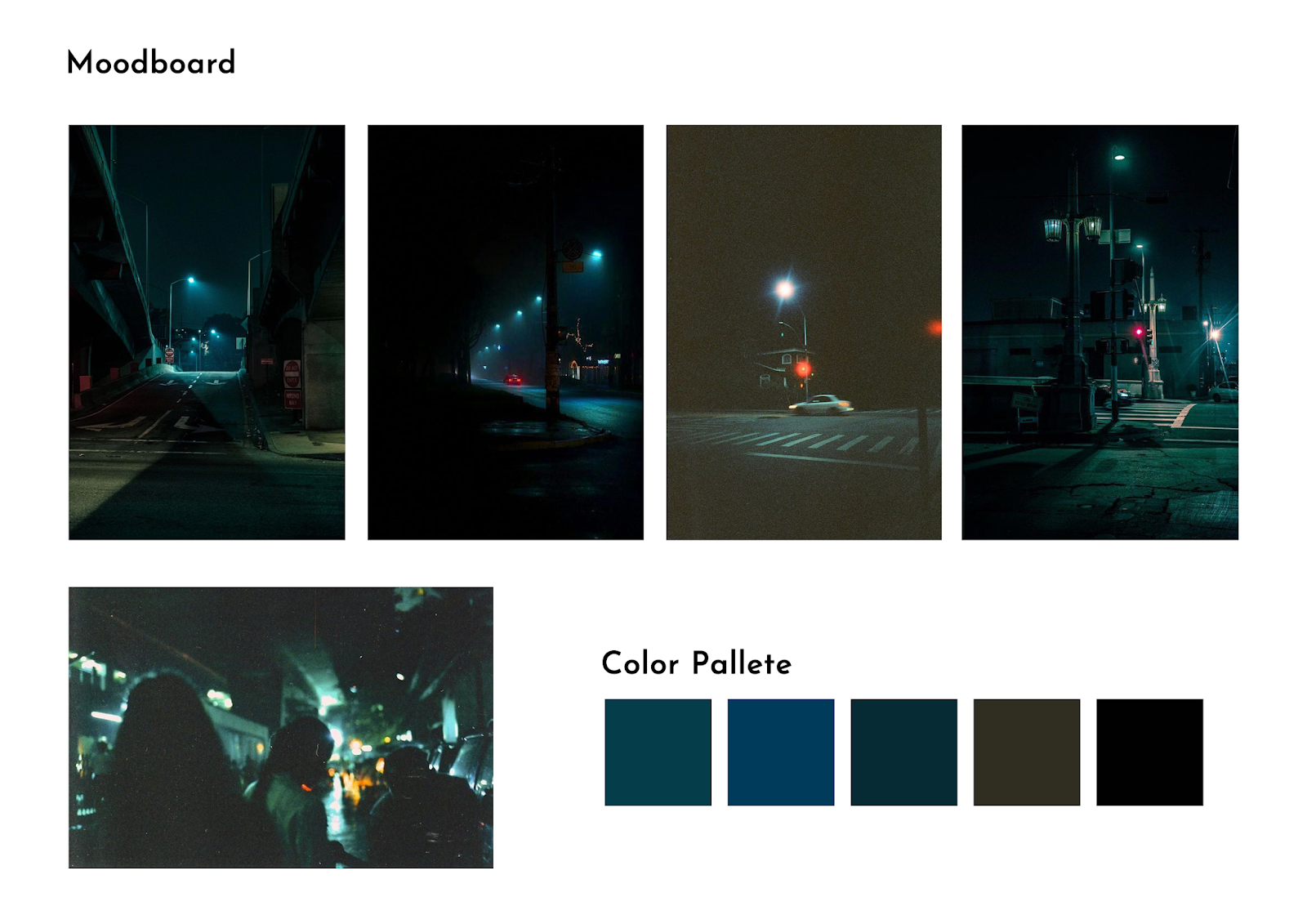
For Week 3, Mr Vinod asked us to come out with some visual references so that we know what style of illustration we are going to illustrate for our book. To start off my visual reference, I thought of since I'm interested in photography, why not replace the illustrations with photography visuals. At the end of the day, I decided to go for film photography as my illustrations.
Here are some of the visual references:
 |
| Fig 1.0: Dark Theme |
 |
| Fig 1.1: Bright Theme |
 |
| Fig 1.2: Filmy Theme |
I want to go for film photography is because I think it fits my contents that I wrote earlier. My content is a mixture of emotions and I think film photography portrays it very well.
22/5/2019 (Week 4)
For Week 4, Mr Vinod wanted us to come out with the artworks that we were planning to do. We need to design 16 artworks that match the 16 sentences that we highlighted previously. The artwork has to visually represent the sentences that we highlighted.
For this week, I designed 4 artworks and showed to Mr Vinod to see if it matches with the ideas that I wanted.
After looking at my first 4 artworks, Mr Vinod told me to try to avoid collage style artworks because it looks pretty basic and also used by many. He asked me to try going to a more abstract direction so that my artwork looks more expressive and also more interesting.
22/5/2019 (Week 4)
For Week 4, Mr Vinod wanted us to come out with the artworks that we were planning to do. We need to design 16 artworks that match the 16 sentences that we highlighted previously. The artwork has to visually represent the sentences that we highlighted.
For this week, I designed 4 artworks and showed to Mr Vinod to see if it matches with the ideas that I wanted.
 |
| Fig 1.3: Artwork #1 |
 |
| Fig 1.4: Artwork #2 |
 |
| Fig 1.5: Artwork #3 |
 |
| Fig 1.6: Artwork #4 |
After looking at my first 4 artworks, Mr Vinod told me to try to avoid collage style artworks because it looks pretty basic and also used by many. He asked me to try going to a more abstract direction so that my artwork looks more expressive and also more interesting.
29/5/2019 (Week 5)
For Week 5, I designed my artworks based on the feedback Mr Vinod has given to me. I went for a more abstract now since it gives out a clearer message and it also looks more interesting.
Here are all the completed artworks that I made for my book:
Here are all the completed artworks that I made for my book:
 |
| Fig 1.7: Artwork #1 |
 |
| Fig 1.8: Artwork #2 |
 |
| Fig 1.9: Artwork #3 |
 |
| Fig 2.0: Artwork #4 |
 |
| Fig 2.1: Artwork #5 |
 |
| Fig 2.2: Artwork #6 |
 |
| Fig 2.3: Artwork #7 |
 |
| Fig 2.4: Artwork #8 |
 |
| Fig 2.5: Artwork #9 |
 |
| Fig 2.6: Artwork #10 |
 |
| Fig 2.7: Artwork #11 |
 |
| Fig 2.8: Artwork #12 |
 |
| Fig 2.9: Artwork #13 |
 |
| Fig 3.0: Artwork #14 |
 |
| Fig 3.1: Artwork #15 |
 |
| Fig 3.2: Artwork #16 |
 |
| Fig 3.3: Artwork Compilation #1 |
 |
| Fig 3.4: Artwork Compilation #2 |
 |
| Fig 3.5: Artwork Compilation #3 |
Feedback
7/4/2019 (Week 2)
Specific Feedback: Mr Vinod asked me to add at least one pull-quote from each chapter and also add some sub-text for my introduction and also for each chapters. He also asked me to do some visual research on how my illustration/photography should be.
15/4/2019 (Week 3)
Specific Feedback: After Mr Vinod showing my visual reference which is film style photography, he gave me some advice about the photograph I can take and also using different assets to form my artworks. For instance, if I want to take a photo of a train station, instead of taking the train station, I can take the pebbles that form the railway so that it represents the train station. He also asked me to use assets such as rough papers textures so that I can make my photograph pop up even more. He also suggested me to take something abstract and combine it with my photographs.
22/4/2019 (Week 4)
Specific Feedback: For my Project 1, Mr Vinod asked me to avoid collage style artworks but instead, go for a more abstract and filmy photography like my initial plan. He asked me to combine my film photography and abstracts art so that it looks better and more authentic.
29/5/2019 (Week 5)
General Feedback: He asked us to update our blogs every week to ensure we don't forget the feedbacks given on that class itself.
Specific Feedback: Mr Vinod told me to reprint my artwork because it was too small to be seen. He also asked me to finish up my artworks since I'm not done with it yet.
Reflection
Experience
1/4/2019 (Week 1)
It was a smooth first week to start off. I find it interesting to come out with our own content for our book. Completing the 3000 words requirement for our content creation wasn't that hard either since I'm writing the things that I'm interested at.
11/4/2019 (Week 2)
Work starts to get pretty hectic starting this week because we need to know what visuals and what style to go for our illustrations. I start to think about my style of illustration and since Mr Vinod allowed us to replace illustration with photography. I decided to go for a filmy photography style.
15/4/2019 (Week 3)
It was a pretty interesting class today because I finally know what style I should go for which is film photography style. After getting some feedback from Mr Vinod, I had a better direction on what can I do with it with his suggestions.
22/4/2019 (Week 4)
I got a lot of useful feedback from Mr Vinod about my artworks for the 16 sentences. After the feedback, I finally understand that he wants me to combine both film photography and also abstracts art into my artwork.
29/5/2019 (Week 5)
Class for today is a little bit more stressful than the previous classes but that is expected since we're at Week 5 already. We learned about grid systems today and I felt that it is so important for my book layout later on.
Observation
1/4/2019 (Week 1)
From the works of our seniors and the contents from my classmates, I observed that everyone has their own stories to like. I also like everyone has their own style which reflects their own personalities.
11/4/2019 (Week 2)
I observed one of our senior's work because she also went for a photography style illustrations. I looked at how she animate it since photography is flat. After knowing it, I started to sketch out and also to find some photos that I've taken.
15/4/2019 (Week 3)
Most of my classmates are going for the illustration style except for a few that also went for the photography style just like me.
22/4/2019 (Week 4)
Everyone is having a pretty fun class because everyone is excited to show their artworks for feedback.
29/5/2019 (Week 5)
Everyone is starting to feel the pressure and also the workload is starting to kick in. We have to work under pressure and that is something to be expected.
Findings
1/4/2019 (Week 1)
At the beginning after hearing that we need to have around 3000 words as our content for the book that we are going to create, I thought it was hard but then when I started to write, the flow just came and it took me a couple hours to finish typing it.
11/4/2019 (Week 2)
Although works are starting to get pretty hectic but I think whatever we're going to do for Publishing Design is for the best for us. I started to realize all the important elements such as the layout, size of the book and the color selection when it comes to publishing a book.
15/4/2019 (Week 3)
I find that going to the photography direction is actually not easy to illustrate and animate because it is flat. I need to be more creative because I need to know when can I do a collage and when to animate it.
22/4/2019 (Week 4)
I find out that adding abstract arts to my artworks make the overall feel more meaningful and also more personality. I need to be more creative in creating my artwork and also to put more thoughts into it.
29/5/2019 (Week 5)
I saw the difference between collage style artworks and also abstract style artworks after I changed my artwork style. Since Mr Vinod asked me to change it, I felt that my abstract style artworks tend to express my sentences better and also it gives out a clearer message to it.
Further Readings
22/4/2019
The Layout Book by Gavin Ambrose and Paul Harris
 |
| The Layout Book (Front) |
 |
| The Layout Book (Back) |
The Layout Book by Gavin Ambrose and Paul Harris is a book that brings us back to the foundation on how to determine and also create guidelines and also layout in design. It explains the principles of layouts, the grids, the hierarchy and also the user readability.
What I like about the book is that it brings us to the user's perspectives when it comes to putting all the information together. There's this page in particular that I like is that it shows us the common eye movements of how a person reads with detailed arrows and also lines. While the book doesn't stop here, it also teaches you how to create guidelines for website and also magazines.
 |
| The Layout Book |
 |
| The Layout Book |
Overall, I think this book is a all of us must read and look through it so that we will have an idea on what a good book layout is. In my opinion, it helped me a lot when it comes to creating my first layout for my Project 1.


Comments
Post a Comment