Advanced Typography - Project 1
Ng Jia Jin (0331589)
Advanced Typography
Project 1: Typosexual Typographic Exhibition - Title and Key Artwork
Lecture Notes
24/9/2018 (Week 5)
For this week's lecture session, it was conducted by 3 groups from the class instead of the lecturers itself. This is to train our presentation skills and communication overall because it's very important in our future course works. The topic that was presented by the 3 groups were surrounding around the History of Typography.
Here are the slides from the 3 groups:
Carol Twombly
Besides this slide, we also got a chance to hear and understand what the lecture topics were given by the remaining groups.
History - Pictograms - Charlemagne
Gutenberg - Present Day
1/10/2018 (Week 6)
For this week's lecture, we have 2 groups to present another 2 topics that is related to typography. This week, we learn mainly about how to construct a typography component and the essential of it.
Here are the slides for the 2 groups:
Anatomy of Type
Thinking Before Drawing
Instruction
The MIB for this project:
24/9/2018 (Week 5)
For this week's class, we got a brief for our first Advanced Typography project. We need to design an artwork with the Typosexual Typographic Exhibition as our title for this project. With the artwork, we need to combine visual elements with the title itself. The combination of title and visual elements will then be our signature artwork for the title. For this project, we can only use a maximum of 1 color other than black in our artwork.
Before doing that, I went on and found some inspirations.
 |
| Fig 1.0: Poster Ideas #1 |
 |
| Fig 1.2: Poster Ideas #2 |
 |
| Fig 1.3: Poster Ideas #3 |
 |
| Fig 1.4: Poster Ideas #4 |
 |
| Fig 1.5: Poster Ideas #5 |
After that, I decided to give the project a go. I designed 2 artworks with the Typosexual Typographic Exhibition title. For the first one, I decided to combine several rectangles together to form a irregular rectangles hole. It purposely put my title as if it's falling down because it matches the rectangles' position.
 |
| Fig 1.6: Key Artwork #1 |
For the 2nd one, I decided to add a cannon as my only visual element because I wanted my Typosexual Typographic Exhibition title to kind of blast out from something. I made the fonts of the alphabets from small to a bigger one to further bring out the overall effect.
 |
| Fig 1.7: Key Artwork #2 |
2/10/2018 (Week 6)
After receiving some feedbacks from my lecturers, I decided to explore some other visual elements that can further bring out the Typosexual word since we only have to include Typosexual only in our key artwork. After some research, I came out with 3 other artworks that I find suitable for the title itself.
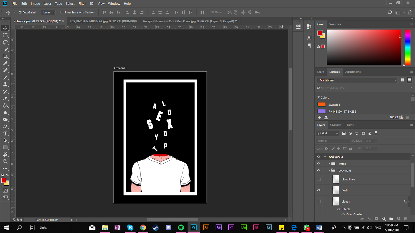
For this key artwork, I decided to add an illustrated body of a guy with his head chopped because I wanted the bloody effect for my artwork. I purposely scrambled my TYPOSEXUAL words around the guy's head with some blood stains because it matches the overall feel of the artwork.
 |
| Fig 1.8: Process on Photoshop |
 |
| Fig 1.9: Key Artwork #3 |
 |
| Fig 2.0: Process on Photoshop |
 |
| Fig 2.1: Key artwork #4 |
For my final key artwork, I used a greek statue of a the person kissing as my main key artwork. I added a dark red color to the statue because I think it suits it better. When I was placing the 'sexual' word behind the statue, I find that people will find it hard to read the overall word so I decided to turn down the visibility for the whole statue.
 |
| Fig 2.2: Processes on Photoshop |
 |
| Fig 2.3: Final Key artwork #5 |
8/10/2018 (Week 7)
After showing Mr Vinod and Mr Shamsul my 3 compositons and getting their feedbacks, I decided to choose my final key artwork #5 as my final composition. Before making is as my final, I tweaked some of the the design from the artwork so that it looks more like a key artwork for any medium.
 |
| Fig 2.4: Key Artwork Chosen |
 |
| Fig 2.5: Image Used |
 |
| Fig 2.6: Final Artwork with Color |
 |
| Fig 2.7: Final Artwork in Black & White |
Feedbacks
Week 6:
General Feedback: For this week's presentation, Mr Vinod said it's fantastic because overall the whole class is engaged with the presentation. For our project 1, Mr Vinod said that most of the class still don't understand what are we supposed to do. We need to emphasize the word Typosexual in our key artwork because it's meant to represent the intimacy of a designer.
Specific Feedback: Mr Vinod said that my key artwork is good but there's no meaning to it. I need to relate the Typosexual word with some visual elements in order to represent it.
Week 7:
General Feedback: Mr Vinod urged the group that presented to make frequent eye contact with the audience to make sure that they get what are they presenting. He also asked us to use the typographic system that we learned to design our poster.
Specific Feedback: Mr Vinod said one of my 3 ideas of my key artwork is interesting but he said it's too big to become a key artwork. He asked me to make it smaller and also change some placement for the 'sexual' word.
Reflections
Experience
Week 6:
After getting the feedbacks from Mr Vinod, I think that I need to explore more ideas instead of just sticking to 1 or 2 ideas only.
Week 7:
After getting the feedbacks I needed from Mr Vinod for my 3 key artwork design, I decided to do more developments in one of the artwork. Overall, I think it was good because Mr Vinod gave me some much needed feedbacks for my key artwork design.
Observations
Week 6:
I went around the classroom to check out my friend's artwork and exploration. I observed some very nice artwork that I took some ideas from. I also observed that most of my classmates struggled to design a key artwork that is related to the Typosexual word.
Week 7:
As usual, I walked around the classroom to check on some of my friend's work so that I can get some ideas from it. One of classmates have implemented her key artwork to her poster and I have to say, the overall design is very aesthetically pleasing.
Week 7:
As usual, I walked around the classroom to check on some of my friend's work so that I can get some ideas from it. One of classmates have implemented her key artwork to her poster and I have to say, the overall design is very aesthetically pleasing.
Findings
Week 6:I find out that it's not as easy as it seems when it comes to design a key artwork that are going to be used in any platform. We need to really understand what is the relationship between the visual element and the work itself. I can relate to that because I've been struggling to find the relationship between the visual element and the words that I need to use.
Week 7:
I find that I'm slowly getting the rhythm of the whole key artwork. I was struggling at first but after doing some exploration, I finally figured out how to implement the words with the visual element. However, I still need to do more exploration because I feel that my exploration of visual artwork is not enough.
Further Reading
100 Classic Graphic Design Journals
30/9/2018
 |
| Fig 2.8: 100 Classic Graphic Design Journals by Steven Heller & Jason Godfrey |
100 Classic Graphic Design Journals by Steven Heller & Jason Godfrey is a journal for graphic designs. The book compiled every poster designs, magazine designs and book designs by various companies around the world throughout the decades. It also explains on why they used certain typefaces in the posters, magazines and books. It also gives a little background history of a certain design and why specific visual elements are placed at the spot instead of another.
What I like about this book/journal is that how detailed everything is. The one thing I like in particular is that it gives full detail of how the ideas of the certain design are from and how everything is fitted into a design. I gained a lot of interesting ideas from this journal as well. I highly recommend this book to anyone out there especially graphic designers at any level because you can gain so much from this journal itself.
Design: Type
7/10/2018
 |
| Fig 2.8: Design: Type by Paul Burgess and Burge Agency |
Design: Type by Paul Burgess and Burge Agency is a book that mainly focus in type based designs. It's a collection of alluring type designs. It has over 600 type based design along with the designers background and which design field he or she is in. It also offers the insight of the author by taking us to a close look on how the type choice is chosen and why the placement is at a certain spot.
At first, I don't understand what is this book all about because all I see is type and that's all but after discovering the book, I realize that every final design always relate to the designer's field itself. I gained a lot of inspiration from this book especially for this project because most of the type designs are connected with an important visual element that represent the whole artwork eventually.


Comments
Post a Comment