Typographic System & Findings
27/8/2018 - 17/9/2018 (Week 1 - Week 4)
Ng Jia Jin (0331589)
Advanced Typography
Typographic Systems & Findings

After understanding all the typographic systems, we need to create 2 layouts for each system with a measurement of 200 x 200 mm.
My typographic system exercise in PDF file:
Type & Play: Part I (Finding Type)
10/9/2018 (Week 3)
For the first part of the second typography exercise, we need to select a photo of a man-made object, nature or architecture structure. After that, we need to import the image into either Adobe Photoshop or Adobe Illustrator. After importing it, we need to identify at least 5 potential letterforms within the image.
Since our picture can only be in black & white, I changed my picture to greyscale tone and gave it a go.
After spending some time exploring the pictures, I found 7 letters from my image. I found the letter A, C, E, H, L, S and T.
I decided to take another picture around my house to explore more letterforms.
I can only manage to find 3 letterfroms from this picture which are L, E and O.
After getting some feedbacks from Mr Vinod, he asked me to dissect the outlines of my image because I didn't dissect it from the picture that I took.
After dissecting the alphabets out, I need to go and refine the alphabets that I have dissected.
Type & Play: Part 2
For the second image, i decided to find an image that I took when I was in Japan.
For the last image, I decided to use an image that I took when I was drinking a cup of coffee.
After getting the feedback from Mr Vinod, he told me that I was just placing the words instead of expressing it so he told me to try again. I decided to express the words on another picture that I found.
Week 2:
Mr Vinod gave the whole class individual feedbacks in the class. After, he briefly gave us a lecture session on what are going to do for our upcoming assignments.
Week 3:
There's no class today.
Week 4:
I didn't observe anything in class because it's a holiday.
Week 5:
I walked around the class to see my classmates' works and I observed some very nice works. I got some inspirations from some works and I decided to redo my works. I also found out that my works are less interesting compare to the others because I didn't really express the sentences.

Ng Jia Jin (0331589)
Advanced Typography
Typographic Systems & Findings

Lecture Notes
Lecture 1: Briefing
27/8/2018 (Week 1)
Mr Vinod gave us a brief overview of what we need to expect from Advanced Typography. He told us that we need to do quite a bit of reading and research because it helps us in our upcoming assignments. After that, he gave us a brief for our first assignment which is called Typographic Systems & Findings. He said that the reason for us to understand the typographic systems & findings is that it will provide us with necessary experience and gain more knowledge to take on our future projects/assignments.
Instructions
Module Information Booklet for Advanced Typography:
Exercise
Typographic System
27/8/2018 (Week 1 - Week 2)
27/8/2018 (Week 1 - Week 2)
We learned about the typographic system which consists of axial, radial, dilatational, random, grid, modular, transitional and bilateral. After that, we need to compile every slides of the respective system into one individual slide.
After understanding all the typographic systems, we need to create 2 layouts for each system with a measurement of 200 x 200 mm.
 |
| Fig 1.0: Bilateral System |
 |
| Fig 1.1: Random System |
 |
| Fig 1.2: Grid System |
 |
| Fig 1.3: Modular System |
 |
| Fig 1.4: Axial System |
 |
| Fig 1.5: Dilatational System |
 |
| Fig 1.6: Radial System |
 |
| Fig 1.7: Transitional System |
Type & Play: Part I (Finding Type)
10/9/2018 (Week 3)
For the first part of the second typography exercise, we need to select a photo of a man-made object, nature or architecture structure. After that, we need to import the image into either Adobe Photoshop or Adobe Illustrator. After importing it, we need to identify at least 5 potential letterforms within the image.
 |
| Fig 1.8: A ladder taken from my house's store room |
Since our picture can only be in black & white, I changed my picture to greyscale tone and gave it a go.
 |
| Fig 1.9: Process in Adobe Illustrator |
After spending some time exploring the pictures, I found 7 letters from my image. I found the letter A, C, E, H, L, S and T.
 |
| Fig 2.0: The Letter 'A' |
 |
| Fi.g 2.1: The Letter 'C' |
 |
| Fig 2.2: The Letter 'E' |
 |
| Fig 2.3: The Letter 'H' |
 |
| Fig 2.4: The Letter 'L' |
 |
| Fig 2.5: The Letter 'S' |
 |
| Fig 2.6: The Letter 'T' |
 |
| Fig 2.7: Compilation for my letterform |
I decided to take another picture around my house to explore more letterforms.
 |
| Fig 2.8: My house's grill door |
 |
| Fig 2.9: Process on Adobe Illustrator |
I can only manage to find 3 letterfroms from this picture which are L, E and O.
 |
| Fig 3.0: The Letter 'L' |
 |
| Fig 3.1: The Letter 'E' |
 |
| Fig 3.2: The Letter 'O' |
 |
| Fig 3.3: Compilation for my letterforms |
After getting some feedbacks from Mr Vinod, he asked me to dissect the outlines of my image because I didn't dissect it from the picture that I took.
 |
| Fig 3.4: Picture Used |
 |
| Fig 3.5: Picture Used (Dissected) |
 |
| Fig 3.6: Alphabet L |
 |
| Fig 3.7: Alphabet T |
 |
| Fig 3.8: Alphabet N |
 |
| Fig 3.9: Alphabet F |
 |
| Fig 4.0: Dissected Alphabets |
After dissecting the alphabets out, I need to go and refine the alphabets that I have dissected.
 |
| Fig 4.1: Refined Alphabets |
Type & Play: Part 2
17/9/2018 (Week 4)
For the next part of this exercise, it's going to be harder than part I of the the exercise because for this exercise we need to find an image between a man-made object, structures or nature and add around 20-30 words in it. We need to express the words so that it somehow 'connects' with the images. We can only use the 10 type families that were given by Mr Vinod during our previous semester. Before adding the words, we need to change our images to a duo tone image.
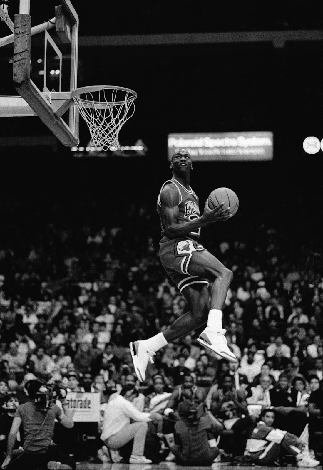
For my first image, I found an image from the internet and decided to express words to it.
 |
| Fig 3.4: An image of a basketball player |
 |
| Fig 3.5: The same image in duo tone colors |
 |
| Fig 3.6: Attempt #1 |
For the second image, i decided to find an image that I took when I was in Japan.
 |
| Fog 3.7: An image of a moutain in Japan |
 |
| Fig 3.8: The same image in duo tone colors |
 |
| Fig 3.9: Attempt #2 |
For the last image, I decided to use an image that I took when I was drinking a cup of coffee.
 |
| Fig 4.0: An image of a cup of coffee |
 |
| Fig 4.1: The same image in duo tone colors |
 |
| Fig 4.2: Attempt #3 |
After getting the feedback from Mr Vinod, he told me that I was just placing the words instead of expressing it so he told me to try again. I decided to express the words on another picture that I found.
 |
| Fig 4.3: Picture Used |
 |
| Fig 4.4: Process on Photoshop |
 |
| Fig 4.5: Final Composition |
Feedbacks
Week 1:
No feedbacks were given.
Week 2:
General Feedback: When it comes to typography systems, there're 3 principles that will affect its design which is communication via the text and overall artwork, readability and composition. Besides that, Mr Vinod asked us to abide the typographic system given when we're designing according to a specific system. We also need to ensure that the overall artwork and text lines are well laid out.
Specific Feedback:
Modular System: decent design overall but the layout that I used is wrong. It's not aligned to to the modular grid system
Random System: decent design overall as all the information given are spread nicely within the square box
Axial System: some sentences are too long as it makes the overall artwork a little unbalance
Week 3:
No feedbacks for this week because there's no class.
Week 4:
No feedbacks for this week because there's no class.
Week 5:
General Feedback: Mr Vinod said that whenever we present, we need to ask more questions so that it will catch the audience's attention. We should also show more examples when we go to a certain topic that's very hard to understand.
Specific Feedback:
Typographic System: Overall design is interesting and decent
Type & Play Part I: Need to dissect the image before finding various letterforms in it
Type & Play Part II: The words at the images are not expressive enough, the words need to be expressive, not just following the outline of the photo
Reflections
Week 1:
Since the first week of class is all about briefing, I didn't really experience anything yet.
Week 2:
As I look back at the works I did from my typography classes from last semester, I think I learned a lot from it especially the overall placement of an object. It really helped me a lot in this exercise because somehow all these exercises are related to our last semester ones.
Week 3:
There's no class today.
Week 4:
There's no class today.
Week 5:
I felt that I need to try harder for both the exercises for Type & Play Part I & II because I think it didn't express enough compare to my classmates's one. For the Part II of Type & Play, I was just expressing the sentences on the line rather than expressing it with a meaning.
Observations
Week 1:
I didn't observe anything.
Week 2:
Mr Vinod gave the whole class individual feedbacks in the class. After, he briefly gave us a lecture session on what are going to do for our upcoming assignments.
Week 3:
There's no class today.
Week 4:
I didn't observe anything in class because it's a holiday.
Week 5:
I walked around the class to see my classmates' works and I observed some very nice works. I got some inspirations from some works and I decided to redo my works. I also found out that my works are less interesting compare to the others because I didn't really express the sentences.
Findings
Week 1:
After learning about the typographic systems from the slides & presentations, I kind of expected what are we going to touch on in our upcoming projects.
Week 2:
I find that I understand the composition of the overall typography system better for this exercise thanks to the works that I have gone through last semester. I can decide on where to put my text better now.
Week 3:
There's no class today.
Week 4:
I didn't find our anything today because there's no class today.
Week 5:
I find myself lacking of ideas for the part II of the exercise and I wasn't trying hard enough.
Further Readings

Typographic System by Kimberly Elam
28/8/2018
Typographic System by Kimberly Elam has helped me a lot on my first exercise. The whole book basically talks about how the 8 typographic systems work in typography. Every system comes with various examples on how we can execute the system perfectly. Each system is explained in detailed so it's perfect for every designer of any level.
I find it very useful because of the detailed explanation for each of the typographic system. Besides I can understand better after going through this book and I highly recommend this to anyone out there who are also learning typography.


Comments
Post a Comment